February 11
Designing Health Information: What Every Health Professional Needs to Know
0 comments
February 11
0 comments

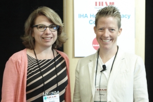
Too often as health professionals, we take care of the content of our messages but give away the power of design when we send it off to someone else. In their presentation, Stacy Robison and Xanthi Scrimgeour encourage health professionals to take back their power for the benefit of their audiences by learning the basic elements of design to create documents and resources that are not only useful and usable but also attractive — because “attractive things work better.” If in creating attractive, well-designed materials we can ease the mental burden placed on the user, we can free up space for them to better use in trying to understand and absorb the material.
To do this, Robison and Scrimegour offer the following ten basic tips for health professionals:
Design is about much more than appearances. If we can successfully utilize tools of visual communication, we can help the readers of our materials to find what they need, understand it when they find it, and remember it after they have read it.
Tags